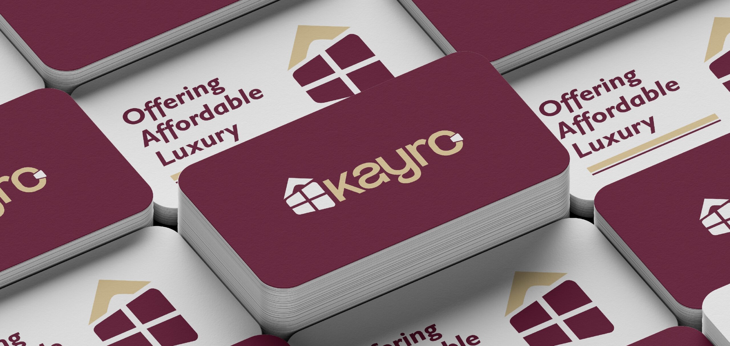
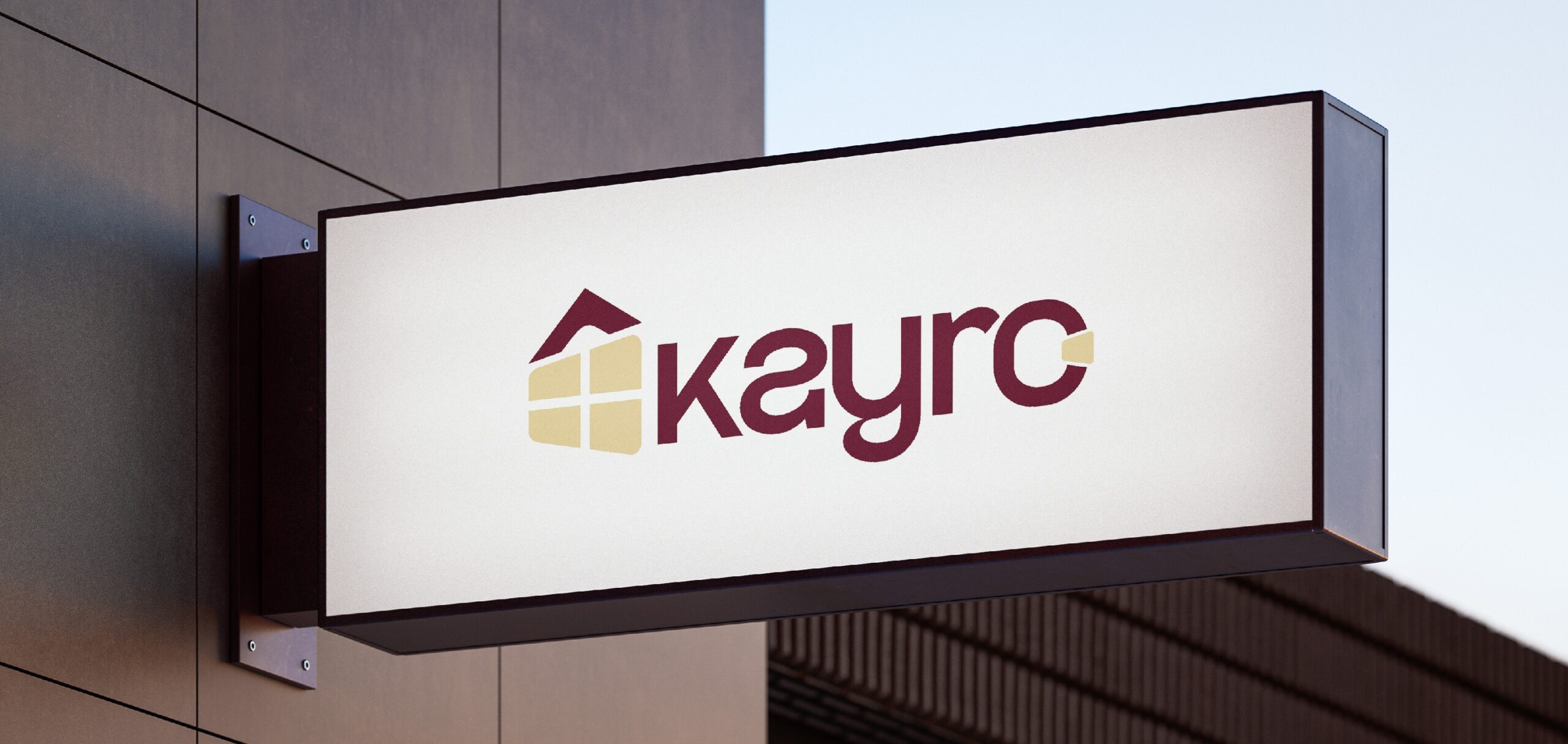
KAYRO
Overview:
Industry: Real Estate / Property Development
Scope: Corporate brand identity
The Problem:
Kayro required a strong visual identity that conveyed stability, trust, and
professionalism while still feeling premium and modern.
Creative Direction:
The brand direction focused on confidence and structure. Clean geometry and
strong typography were used to reflect reliability and long-term value.
Target audience:
Property investors
Corporate clients
High-value buyers
Design Execution:
Monogram-style logo
Deep, grounded color palette
Bold serif or structured sans-serif
Intended Outcome:
To position Kayro as a credible and premium real estate brand that inspires
confidence and authority.