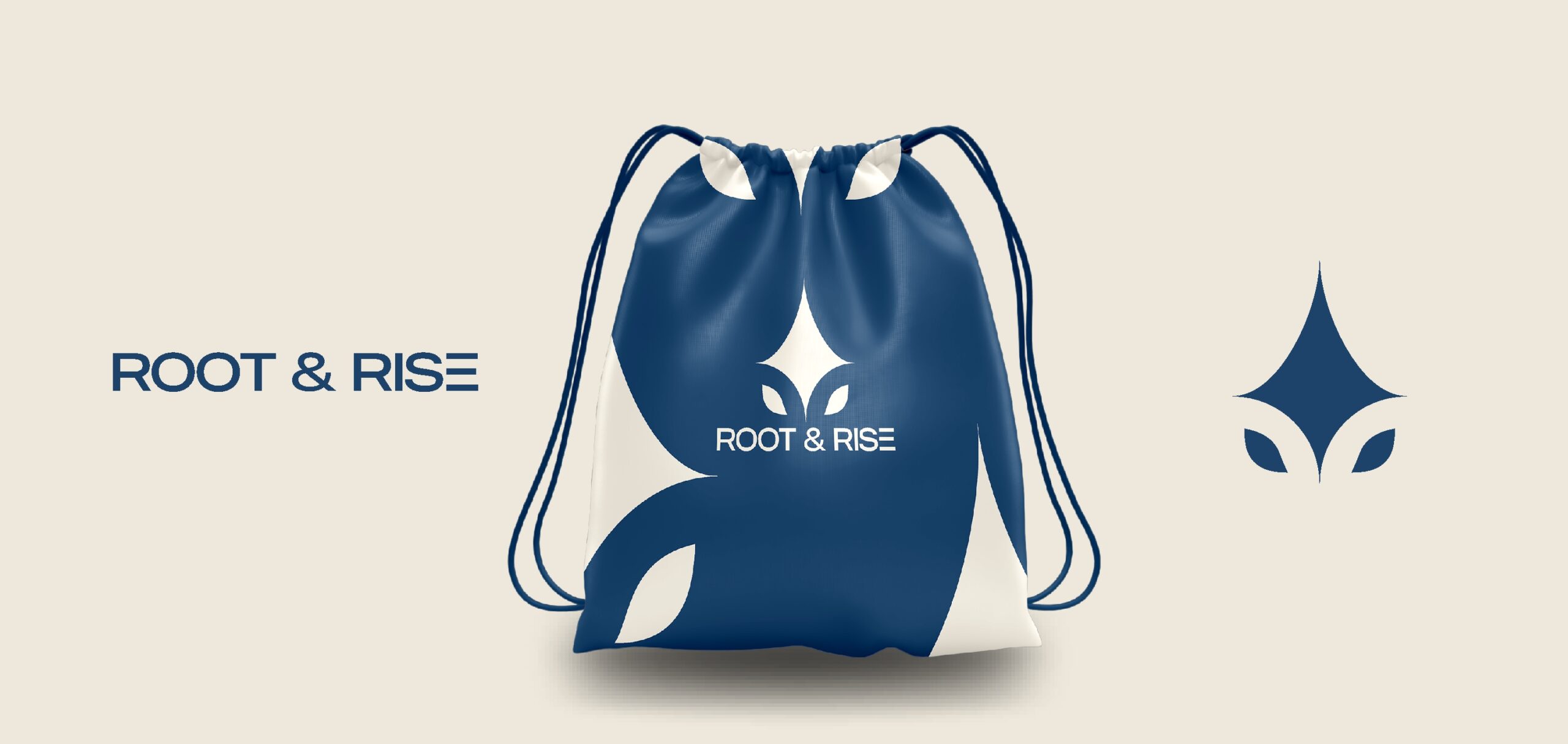
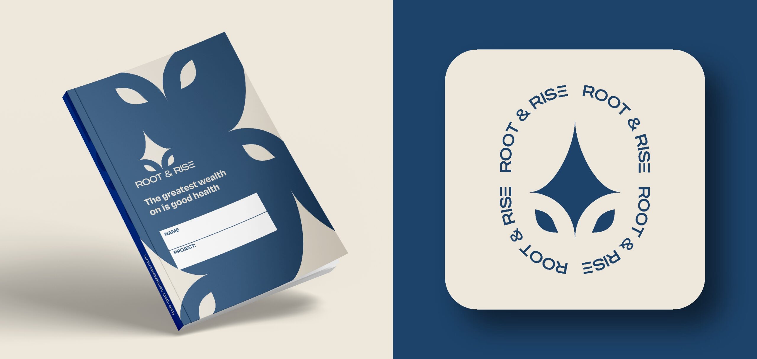
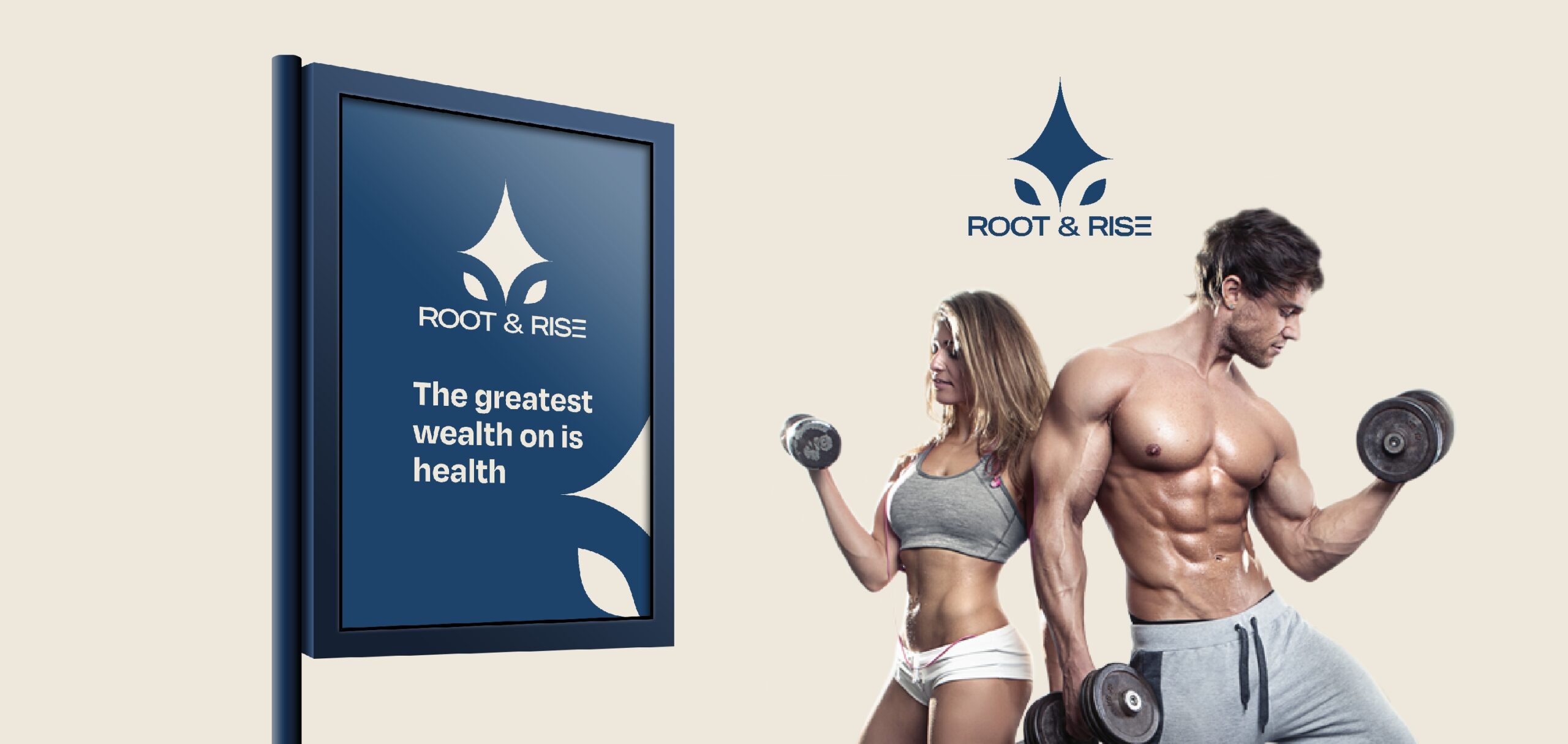
ROOT & RISE
Overview:
Industry: Wellness / Mental Health
Scope: Brand identity
The Problem:
Root & Rise needed a brand identity that communicated growth, balance, and
emotional safety without leaning into clichés often seen in wellness branding.
Creative Direction:
The direction emphasized grounded calmness—organic shapes, soft tones, and a
nurturing visual language that feels human and reassuring.
Target audience:
Young adults & professionals
Individuals seeking personal growth or therapy support
Design Execution:
Symbol + wordmark logo
Earthy, muted color palette
Soft rounded typography
Intended Outcome:
To create a brand that feels safe, supportive, and emotionally intelligent,
encouraging trust and openness from its audience.