AUREN
Overview:
Industry: Luxury Skincare
Scope: Brand identity & visual system
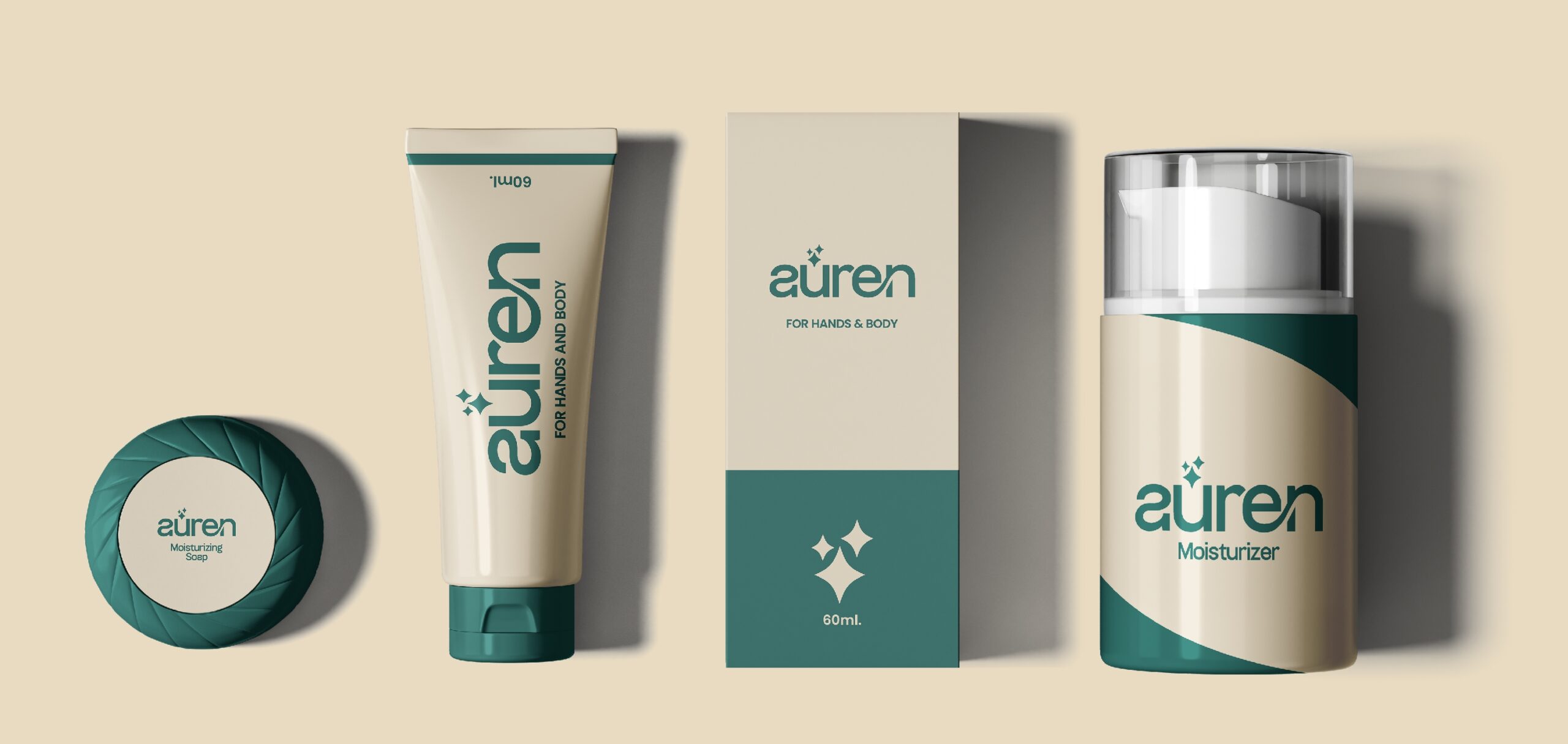
The Problem:
Auren is a new premium skincare brand entering a saturated market where most
competitors rely on loud visuals or overly clinical branding. The brand needed to
appear refined, trustworthy, and timeless while still feeling modern and
approachable.
Creative Direction:
The direction focused on quiet luxury.
The brand was designed to feel soft, intentional, and elevated—appealing to
consumers who value quality, simplicity, and subtle sophistication over trends.
Target audience:
Women & men, 25–45
Skincare-conscious
Design-aware consumers
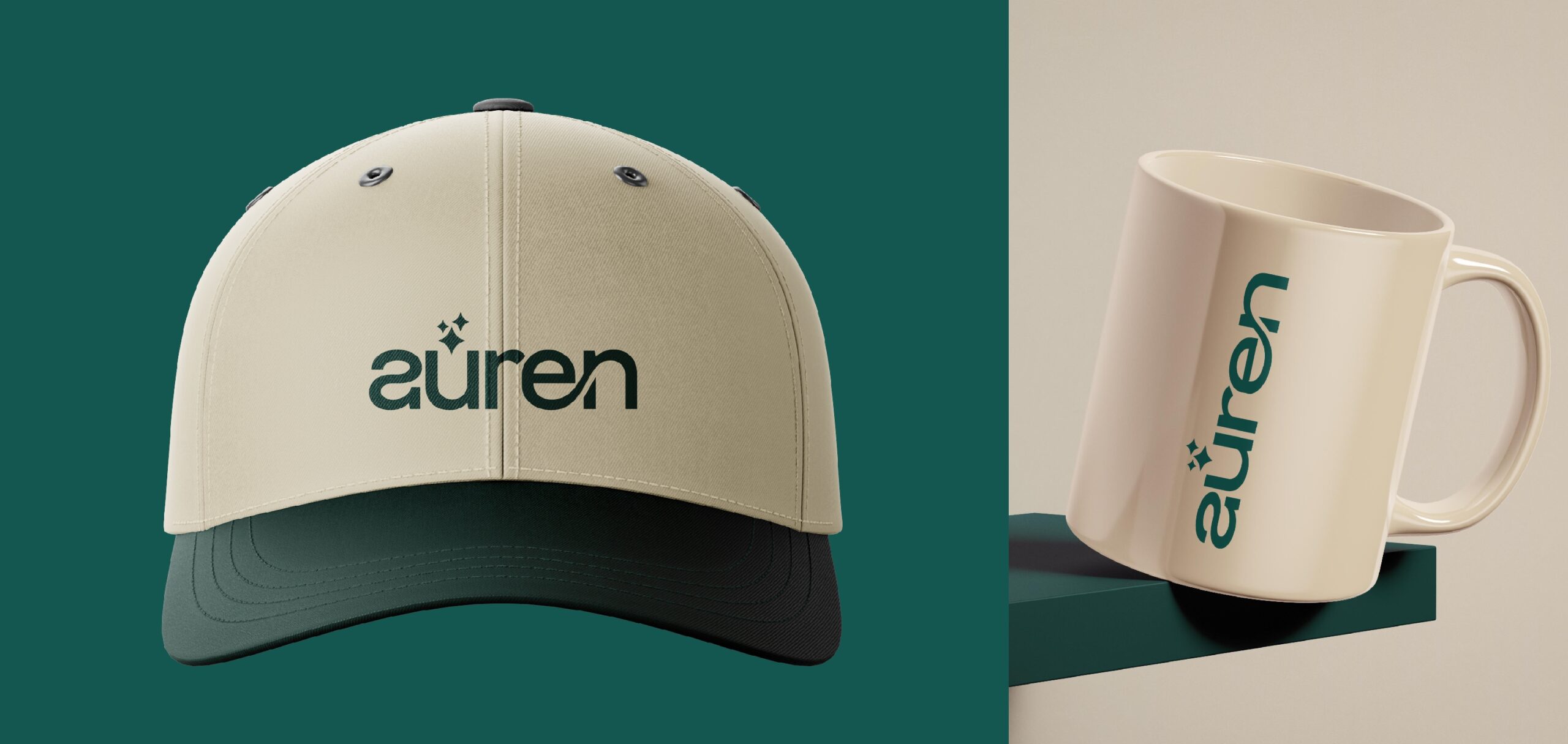
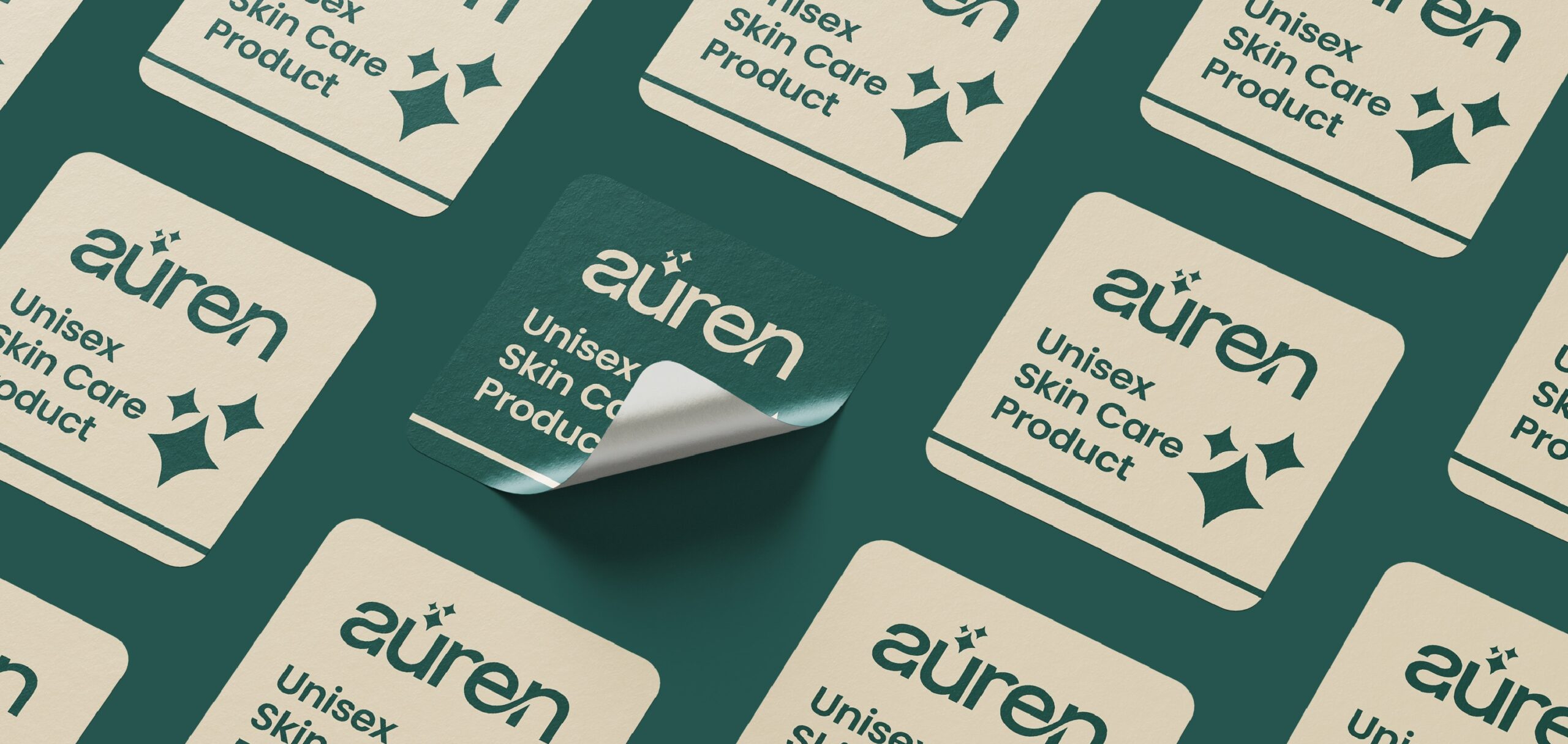
Design Execution:
Minimal wordmark logo
Neutral, warm color palette
Elegant serif + clean sans-serif pairing
Intended Outcome:
To position Auren as a high-end skincare brand that feels calm, premium, and
trustworthy, standing out through restraint rather than excess.